JobHunting
introduction
Overview
final animation
JobHunting Animation
process
Storyboards
Coming with a few concepts in mind, I sketched out my ideas into storyboards to plan scenes and test out different ideas. An example scene that made it into the final cut is below.

Typography
After designing the final storyboard, it was clear that animation would be text-heavy. I needed a typeface that could be easily read on digital screens. I explored Google Fonts to find a typeface that would be both legible and commical.

Color
To represent the frustration behind a difficult job search, I used the main colors of fire: orange and red. Going to the other side of the color wheel, a cooling blue offered a great contrast and represented a calmer voice.

Style Frames
The next stage combined my visual elements with my storyboards. Each style frame established a shot or scene to be animated later. It allowed me to play with how the type and color could work each other before adding in any motion.

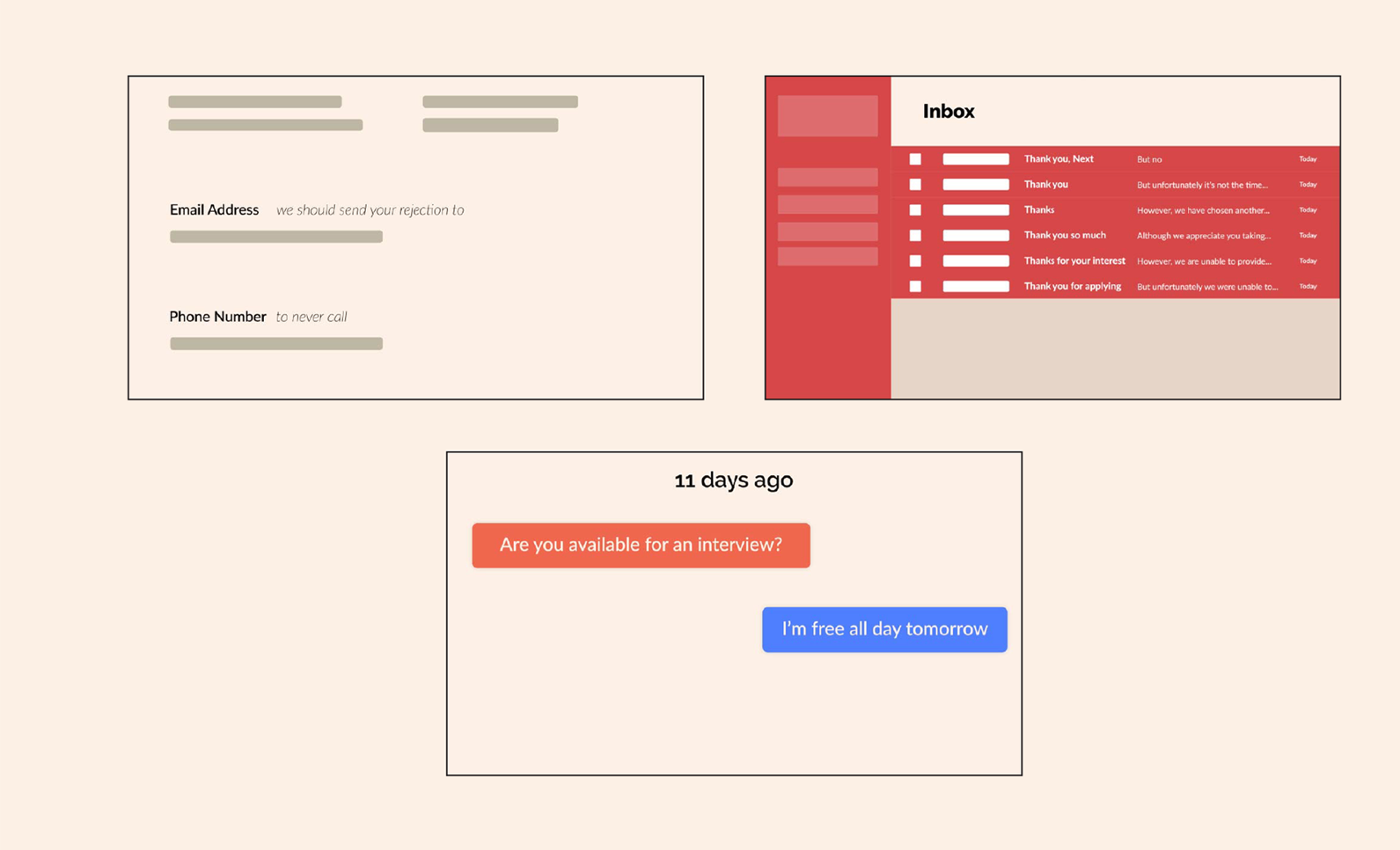
Because job applications are so text-heavy, I wanted to abstract the layers of text the audience did not need to see. In the style frame stage, I stumbled on a "wireframe" look that employed rectangles to represent text. It was successful in how it drew the audience to the text that was important for the narrative.

Final Stills
Finally, I constructed scenes in Adobe After Effects to create the final cut. Below are some example shots from the animation.

conclusion
Results
The final animation was featured in the Metropolitan Computer Animation Festival. It also won the "Most Comedic" award in my Motion Graphics class.
Challenges and Lessons
Finding the Right Song
One the main challenges was finding the right audio. A lot of music is copyrighted and could not be used in my animation. It took some time to decide on the right song, but I found the one that had a good sense of humor.
Timing is Everything
Like a dancer has to time themself to the music, I had to time my animation to the audio I chose. Storyboarding and creating After Effects Markers helped me time my animations to the music.