Subconscious: Mental Health Storytelling Platform Redesign
introduction
Overview
research
User Testing on the Original Website
The first step in the process was conducting user tests with real people. My main tool was UserTesting.com that provided video and audio recordings of people exploring the Subconscious website.
Key Insights
Finding a story is challenging without navigation or search tools
This makes it more difficult for users to find the stories they're interested in.
Readers are hesistant to donate because they are unsure where Donations go
One opportunity is to redesign how donations are presented
Personas and Journey Maps
Personas and Journey Maps helped summarize my research results to the Subconscious organization. With these, I was able to have a conversation with organization leaders on how we could better introduce Subconscious to new readers. The documents guided my designs as I thought about how I could improve Jamie's and Tara's experiences on the Subconscious website.
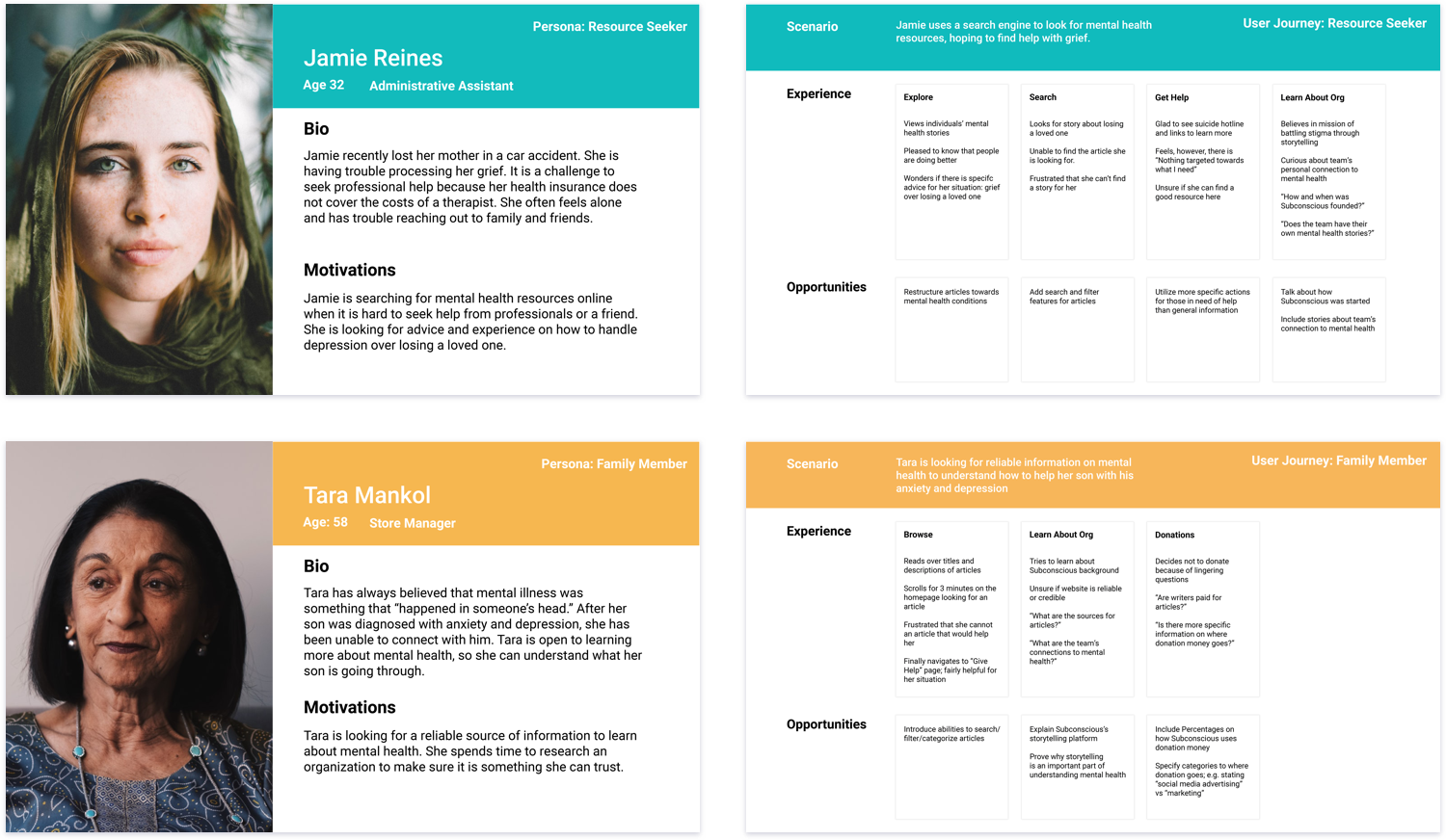
Making Mental Health Stories Easier to Find
Problem: When asked to find a specific story participants took 2-4 minutes to find. 2/7 participants were unable to find the story at all. The main reason was that there were no search or filter tools. Participants had to scroll until they found the right article.
Exploration and Concepts
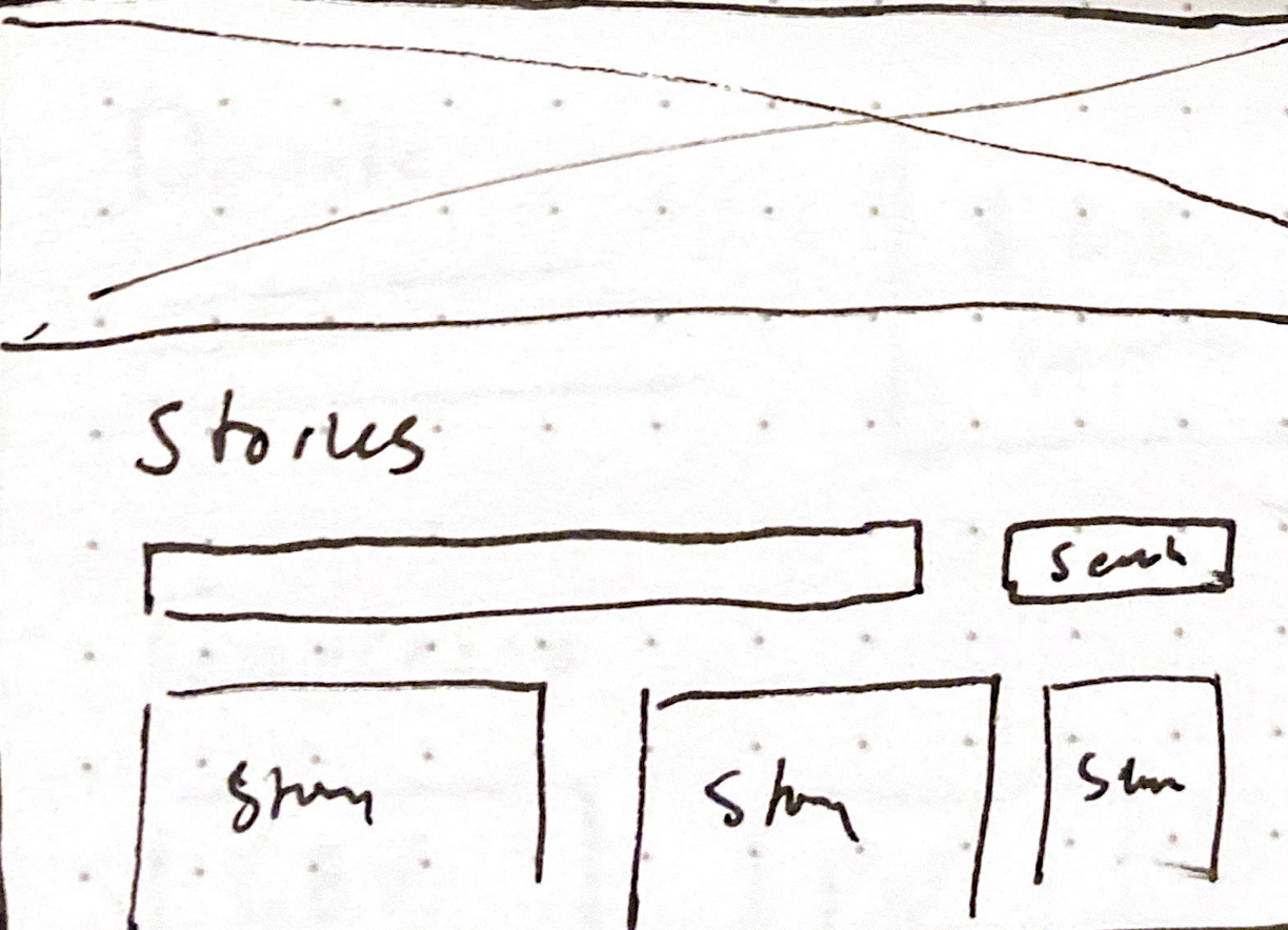
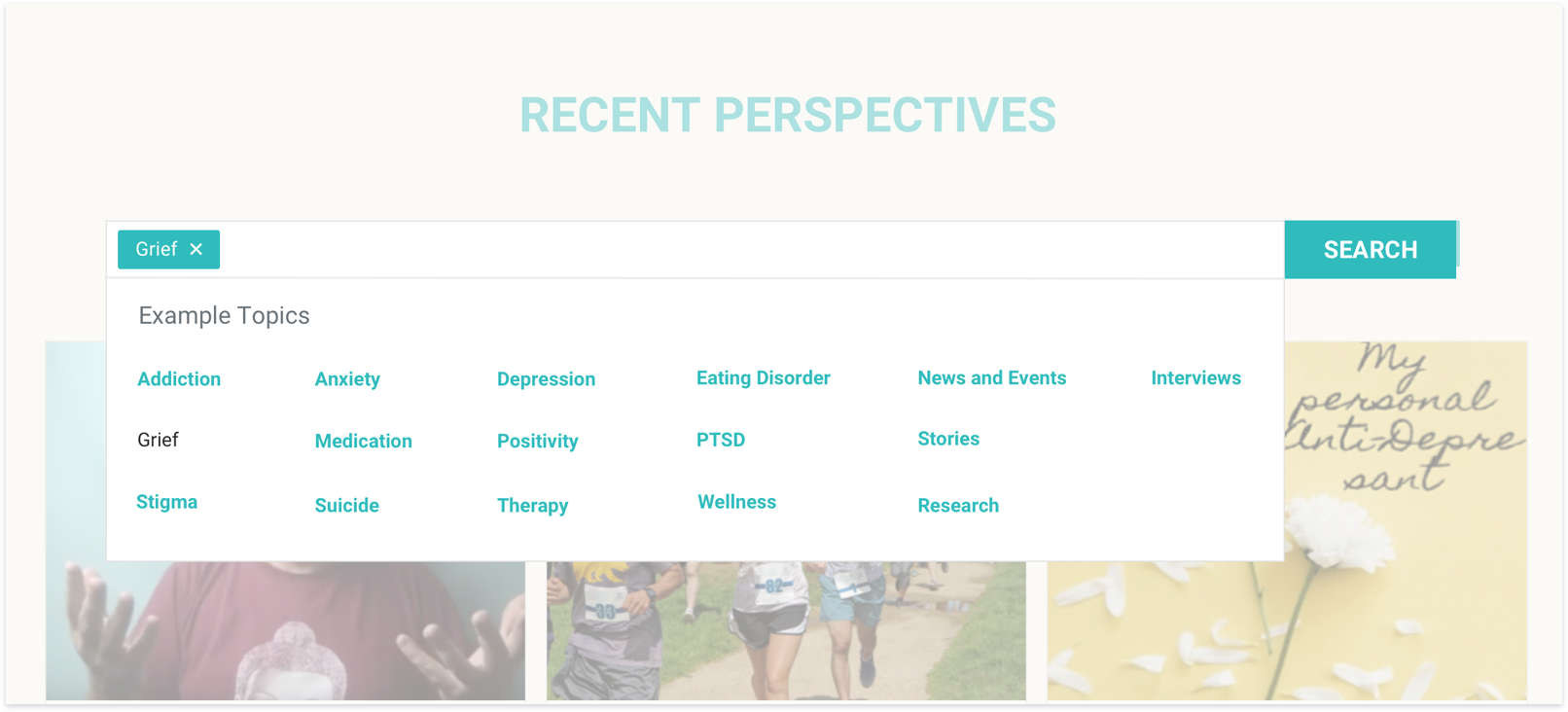
Simple Search Bar
Rationale: The initial idea was to give a open space to request a story. Most of the participants had an idea or topic that they wanted to search. The goal is give a space to provide that input.
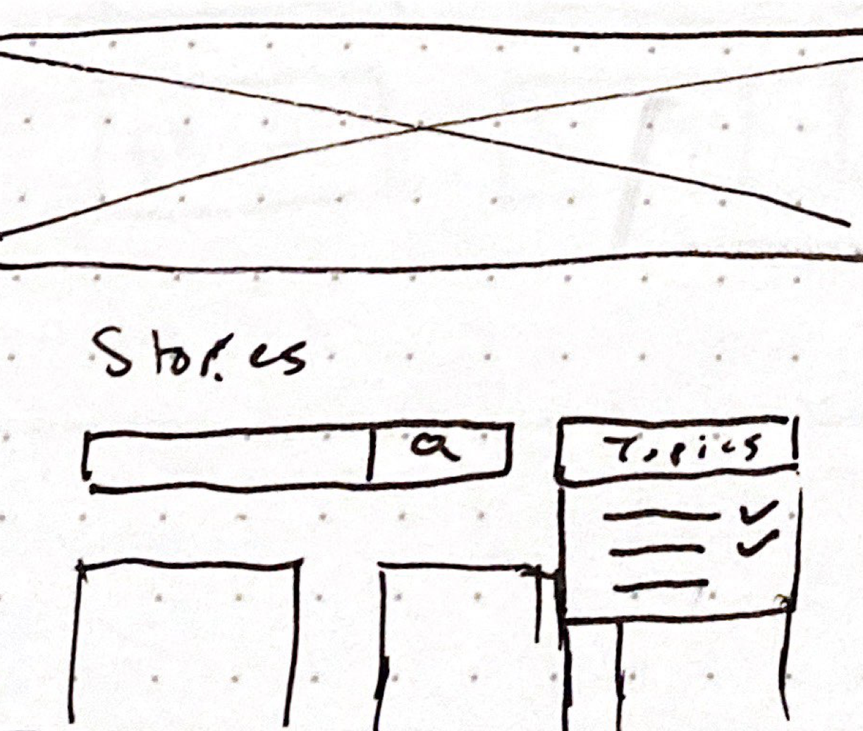
Allowing Readers to Filter Stories By Search and Topic
Rationale: One of the participants was unsure about specific topics in mental health did Subconscious focus on. I added a dropdown to list some example topics in case a similar user was unsure what they might find on the site.
Final Solution
Solution: The final design drew inspiration from the autofill function of a Google Search and AngelList to provide search suggestions. The goal is provide both an open space to search as well as direction on what can be found.
Success Criteria: Percentage of successful searches (initiated a search and did view a story), Number of times each "Example Topics" was used, Percentage of stories found without searching.
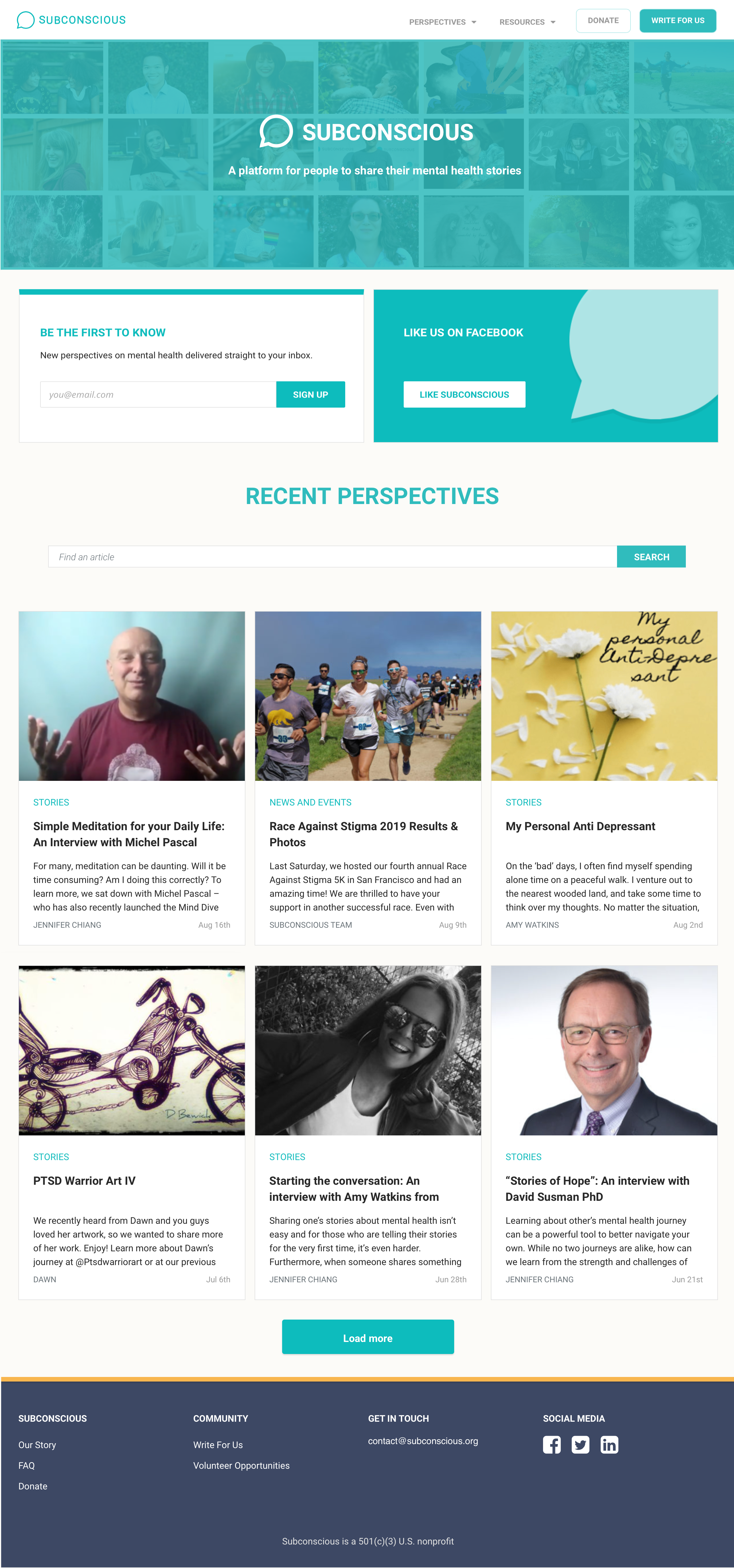
Full Homepage
Making Donations Clear and Transparent
Categories do not paint clear picture of how donation is spent
Problem: 4/7 participants who reported that they would be unlikely to donate were also unsure about how their donation would support Subconscious. The description of where donations go was too ambigious and left participants uncertain of what their money would be used for.
Exploration and Concepts
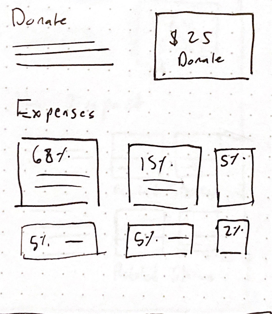
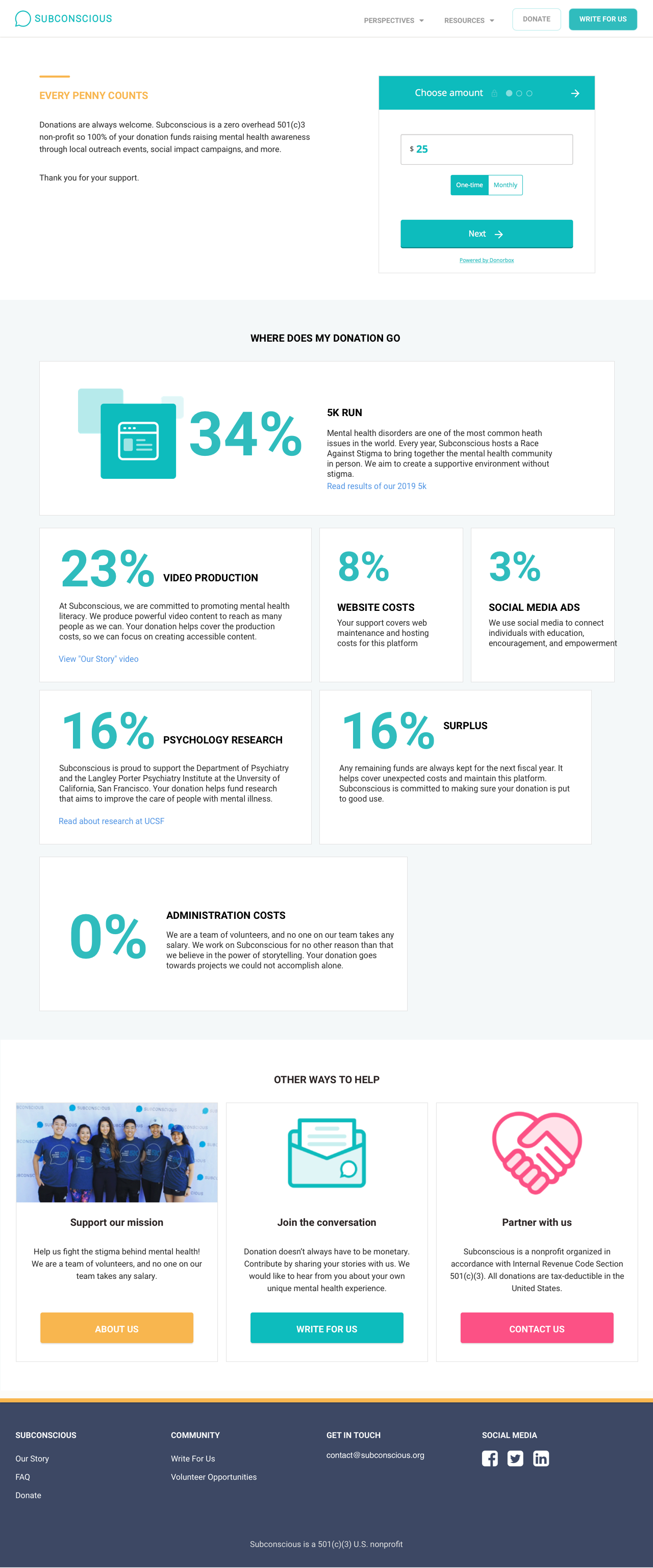
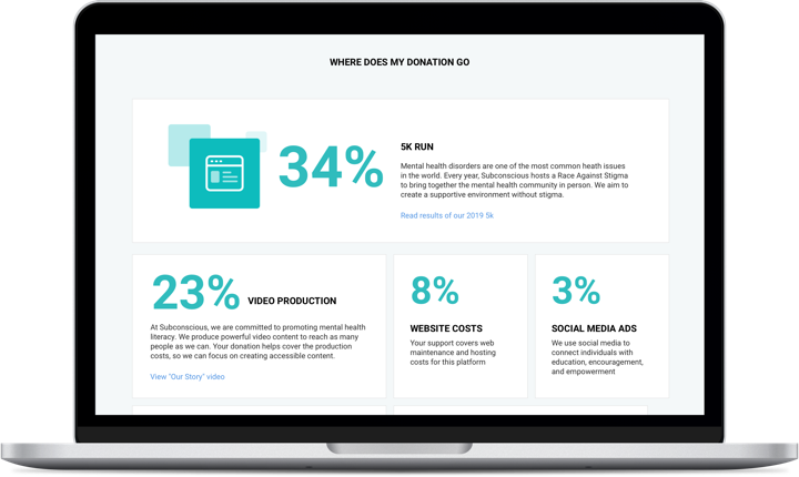
Percentage Breakdown
Rationale: Participants from testing noted how the site was vague about where donations go. I collaborated with the operations officer to go over their yearly expenditures. We thought of displaying this breakdown on the website to have a specific breakdown of where donation money goes.
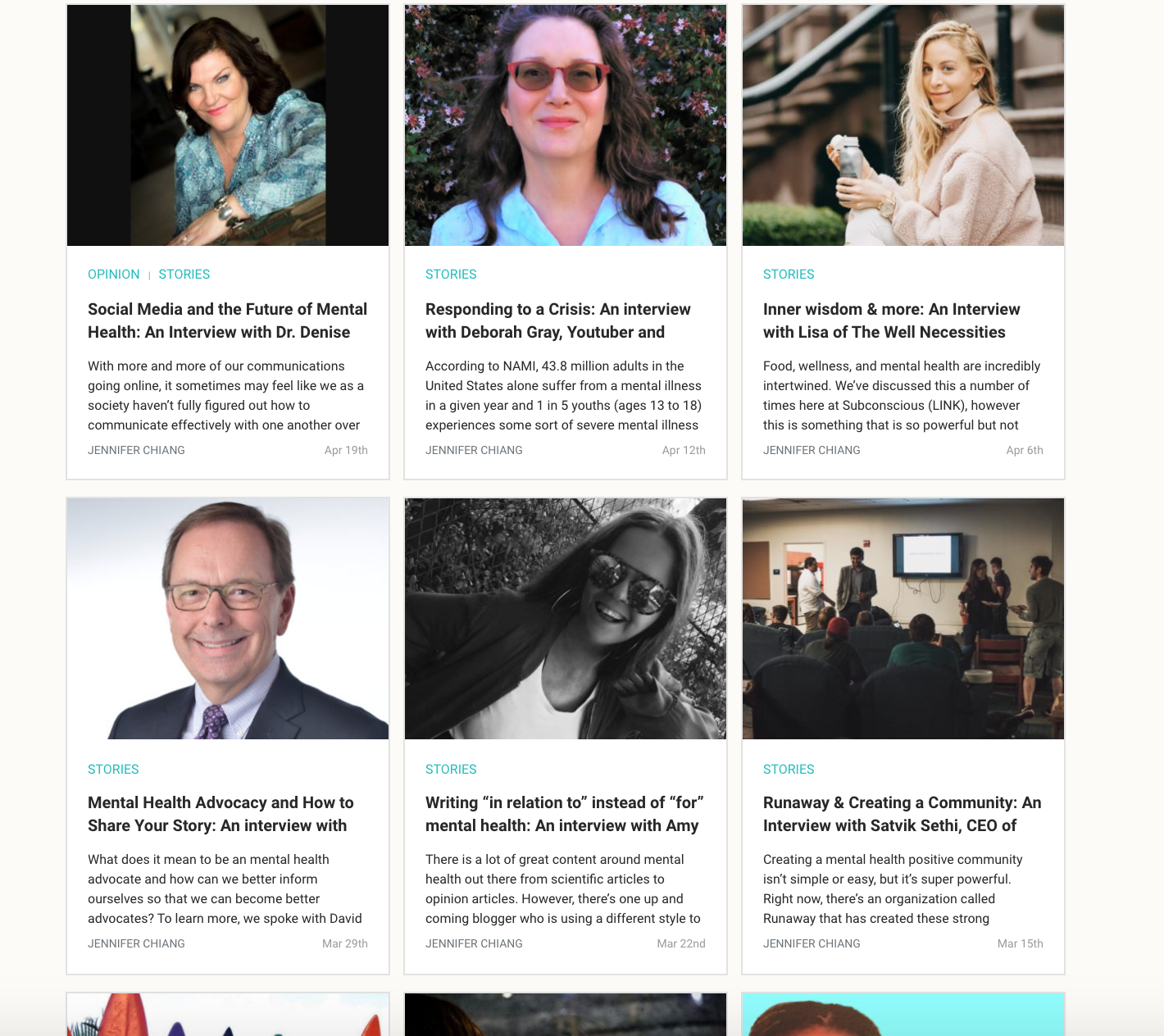
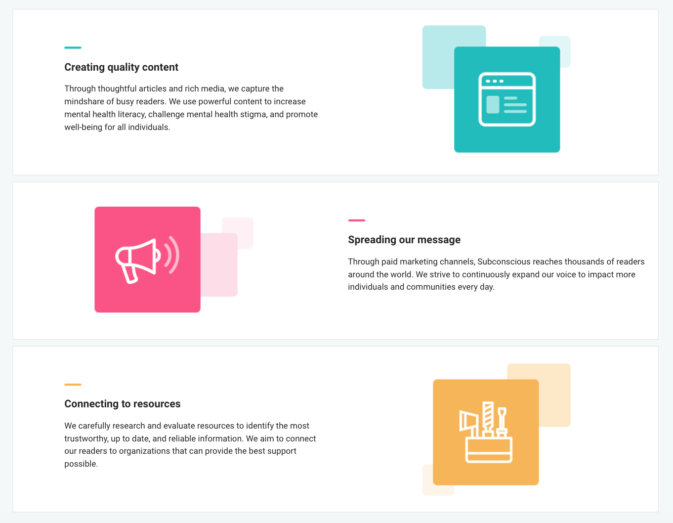
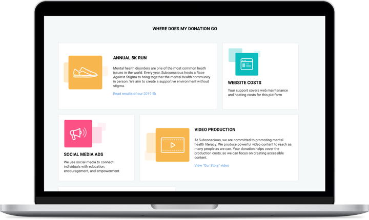
Highlight Successes in Events and Articles
Rationale: Another approach was to showcase the impact a donation will have. Subconsicous publishes some articles on they events they run or milestones in their non-profit journey. Highlighting these moments could give a better picture of what a donation will support.
Final Solution
Solution: The key problem from user testing seemed to be the vague descriptions of where donations go. A visual percentage breakdown added the transparency they were searching for. In addition, some elements of the breakdown have links to articles that highlight accomplisments.
Success Criteria: Number of donations, amount of money donated, views of donation grid, qualitative feedback from surveys or user testing
A/B Testing
My design mentor and I were curious about how people would react to donations with and without explicit percentages. To test this, we created an A/B test on Usertesting.com. We had two prototypes, in which the only difference was the Donations page.
Version A Donations are stated with explicit percentages.
Version B Donations are represented by graphical icons.
Testing Results
Readers were as likely to donate with version A as with version B
There were no significant differences between how readers responded to either versions of the donation page
Compared to the original site, participants reported that they were 40% more likely to donate.
For both the original site and the redesign participants were asked to rate how likely they would be to donate to Subconscious. The average ratings for the redesign was 40% higher than for the original site.
No issues found finding information about donations or about the Subconscious organization
The participants in the redesign reported no problems finding information throughout the site.
conclusion
Results
- Told the story of Subconscious, a mission driven non-profit dedicated to people's mental health stories.
- Solved navigation issues to find mental health stories through search tools
- Developed the About Us page to show readers how the organization started
- Increased clarity and transparency about donations and Subconscious.
Deliverables The final deliverables for my work were personas and journey maps to support future redesign efforts as well as a final prototype of my redesign to development.
View Final Personas and Journey MapsVisit Final PrototypeLessons
Designing for Mental Health
Everyone in the Subconscious organization and users I met through user testing shared their personal connections to mental health. Redesigning the web platform gave me more perspective into the struggles and journies of people I never had designed for. Hearing these stories not only helped me build empathy with potential users but also reinforced the Subconscious mission of learning about the people behind a diagnosis.
Conducting Unmoderated User Testing
This was the first time I created an unmoderated user test. The challenge was to create a comprehensive test plan that covered the experience of a reader exploring the website. I woudn't be able to moderate or delve deeper into user insights. I previewed the test multiple times and received feedback from my design mentor to ensure that my questions and tasks would touch upon multiple parts of the website.